Yesterday, I was so pleased to have an arrangement featured at the Vieux Carre Commission Foundation Gala at Galatoire’s. I loved the arrangement and the muted palette perfectly complemented the invitation’s watercolor design. Here is some insight behind the color choices…
Here is what I started with:
When planning an event, it is important to choose a color scheme. Color should provide an underlying theme and cohesive look to the event. The invitation is the first glimpse a guest has of the soiree, so when I saw the above design, I knew what color palette to draw from.
When deciding on flowers on an event, I normally choose a focal flower first. The best advice a mentor told me was to look at a single petal and see what colors are in the petal. That should drive color choice and create natural color transitions. For example, if your focal flower is a bi-color rose, your ancillary flowers should reflect both hues that are visible in the petal.
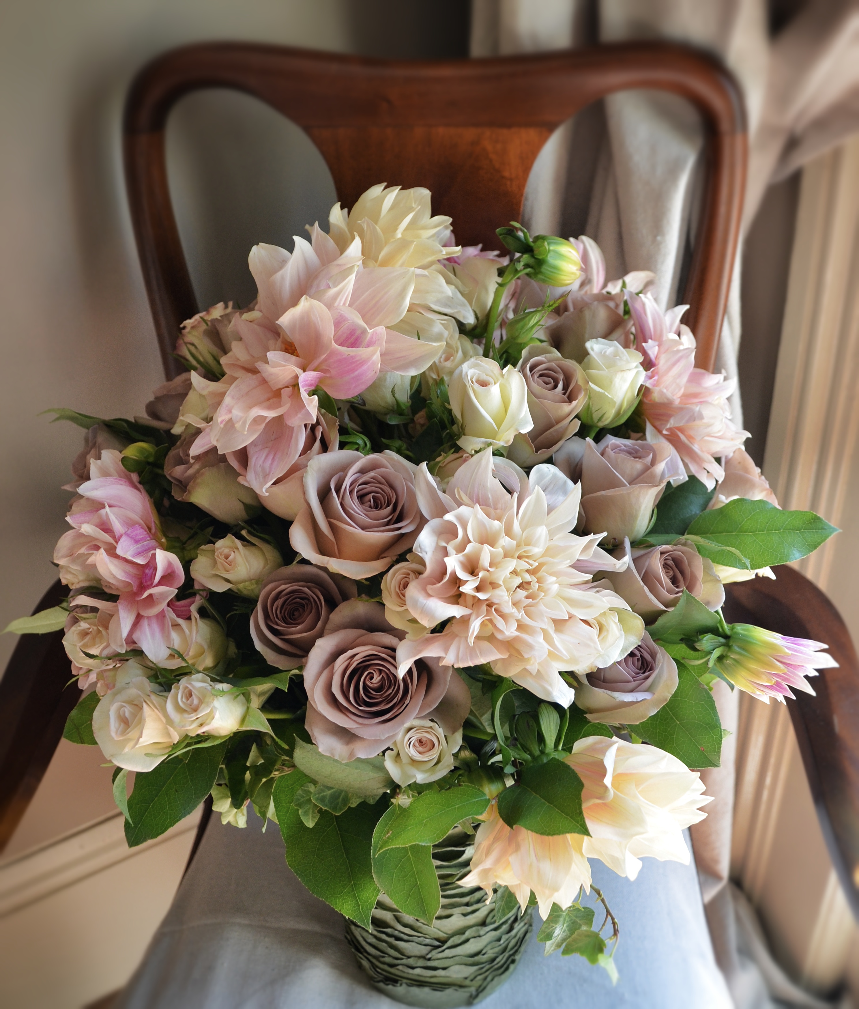
In this instance, I knew that I wanted to use “Cafe Au Lait” dahlias; the blooms are large and delicate, with blush tones. To play up the deeper pink color eminating from the center of the dahlias, I chose “Amnesia” roses. These particular roses have a muted lavender color, with mauve undertones, which gave depth to the arrangement. “Porcelina” spray roses were then added for texture, while reinforcing the creamy blush palette. Below is the end result…
My opinion on color theory is to let the flowers guide your process. There are so many varieties available, and with color, the opportunities are endless.
“The artist is the confidant of nature, flowers carry on dialogues with him through the graceful bending of their stems and the harmoniously tinted nuances of their blossoms.” – Rodin